
You’ll often find that interior designers suggest displaying your wall art in odd numbers, such as groupings of three or five, for the visual appeal it produces; however, hanging your art in even numbers can create a sense of calm within a space and the illusion of one singular piece, foster connections that aren’t always possible with a single piece of art, and bring about flexibility with a modern flair.
Simply stated, duos are wonderfully dynamic.
So, should you break the rules and see double?
“When it comes to hanging art on a wall, design experts will always suggest that you decorate in odd numbers because they naturally promote interest,” explains Taryn Williford in her post, “Yes, You Can Hang Art in Twos: Here’s the Secret to Making Pairs Work,” for Apartment Therapy. “But art in pairs can be pretty harmonious, too.”
Enter the diptych.
What is a Diptych?
In her article, “We’re Into: Diptychs & Triptychs” for Ballard Designs, Caroline McDonald explains that “Diptychs and triptychs come from the Greek meaning two- (dip) or three- (trip) fold (tych) and historically refer to any objects or works of art that are divided into panels and hinged together. Heavily used for religious iconography in churches and cathedrals from the Middle Ages on, diptychs and triptychs in today’s art world are simply a creative continuation of a piece of art on two or more canvases.”
“The versatility of diptychs and triptychs is what keeps us coming back to them,” adds McDonald. “It’s kind of like buying a pair of lamps—they’re gorgeous apart but better together! Others may share a near-mirror image that ties the panels together but work equally well on their own. This gives you more flexibility depending on the size of your wall space. If you move or your space changes, you can hang them separately to create two different focal points.”
If you’re ready to decorate with diptychs for double dog delight, these tips and visuals will have you well on your way to a beautiful two-piece display.
Using Diptychs to Create Connection in Your Pet Portraits
“Some diptychs are merely parts of an image that create a complete story when hung side-by-side,” explains McDonald. “While either print can hang on its own or even vertically, they really add impact when hung together horizontally.”
The catch is, unlike wall art groupings of five or nine, a two-piece grouping requires you to be intentional in choosing pieces with strong similarities, whether that be the frames, the colors and tones of the portraits, or the subject. Too much variety will cause diptychs to look disjointed rather than cohesive and connected.
Choose Colors That Compliment
Another key element to creating connection in your diptych is choosing portraits with colors that complement the space in which you’ll be displaying it as well as the portraits you’ll be pairing together.
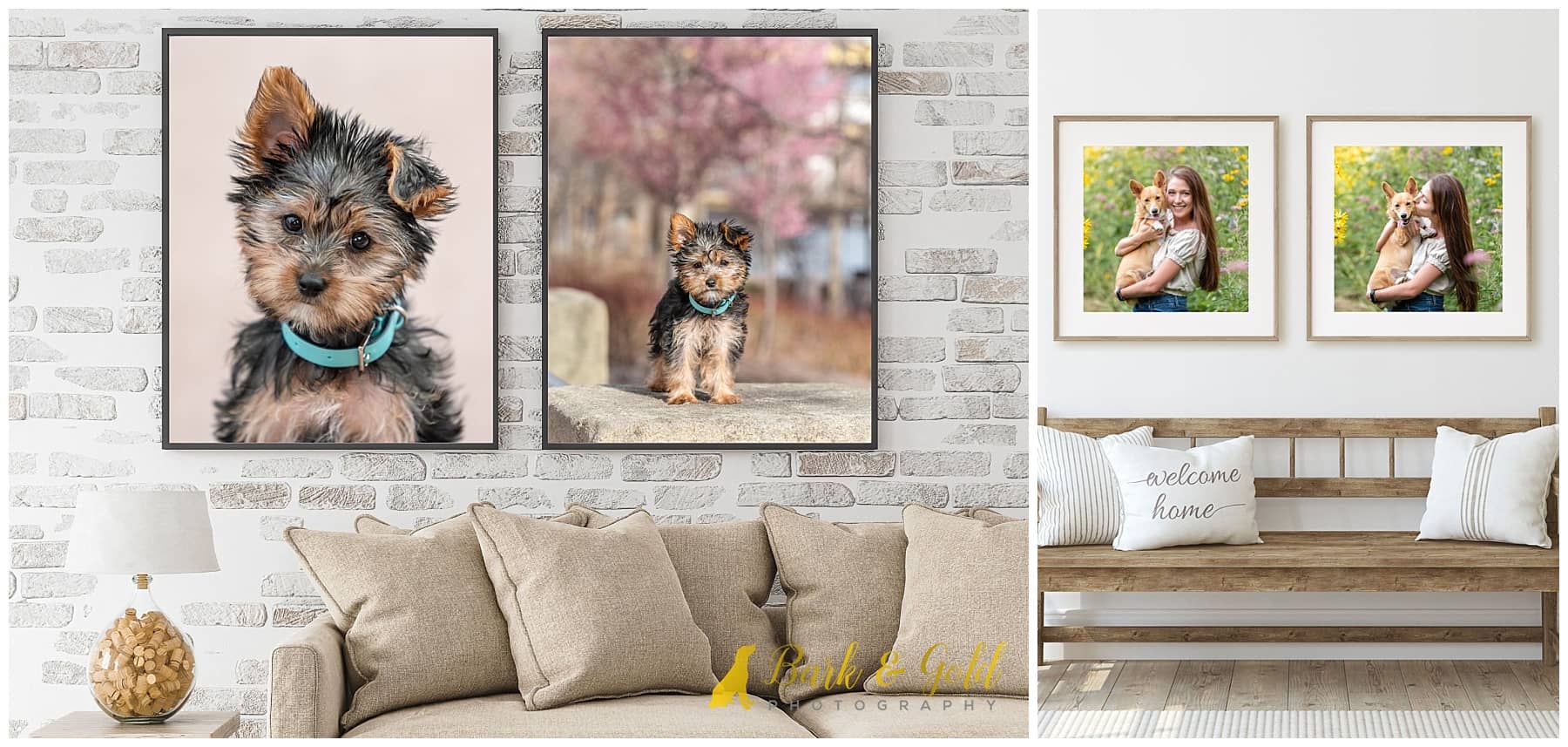
From the tones of your portraits to the material and color of your frames, a similar palette will shape an intentional, uniform display. Look for one or two colors within your images that repeat, such as pops of yellow from a flower field or the soft taupe tones of a furry face. In the above diptych of Xap, for example, you’ll notice that while the colors in her photos don’t match exactly, they are similar enough that the blush pink of her headshot background ties into the blooming cherry blossom trees of the second portrait. A charcoal-colored solid wood frame highlights the canvas and adds contrast against the tan tones while enriching the Xap’s darker fur, creating a compatible presentation.
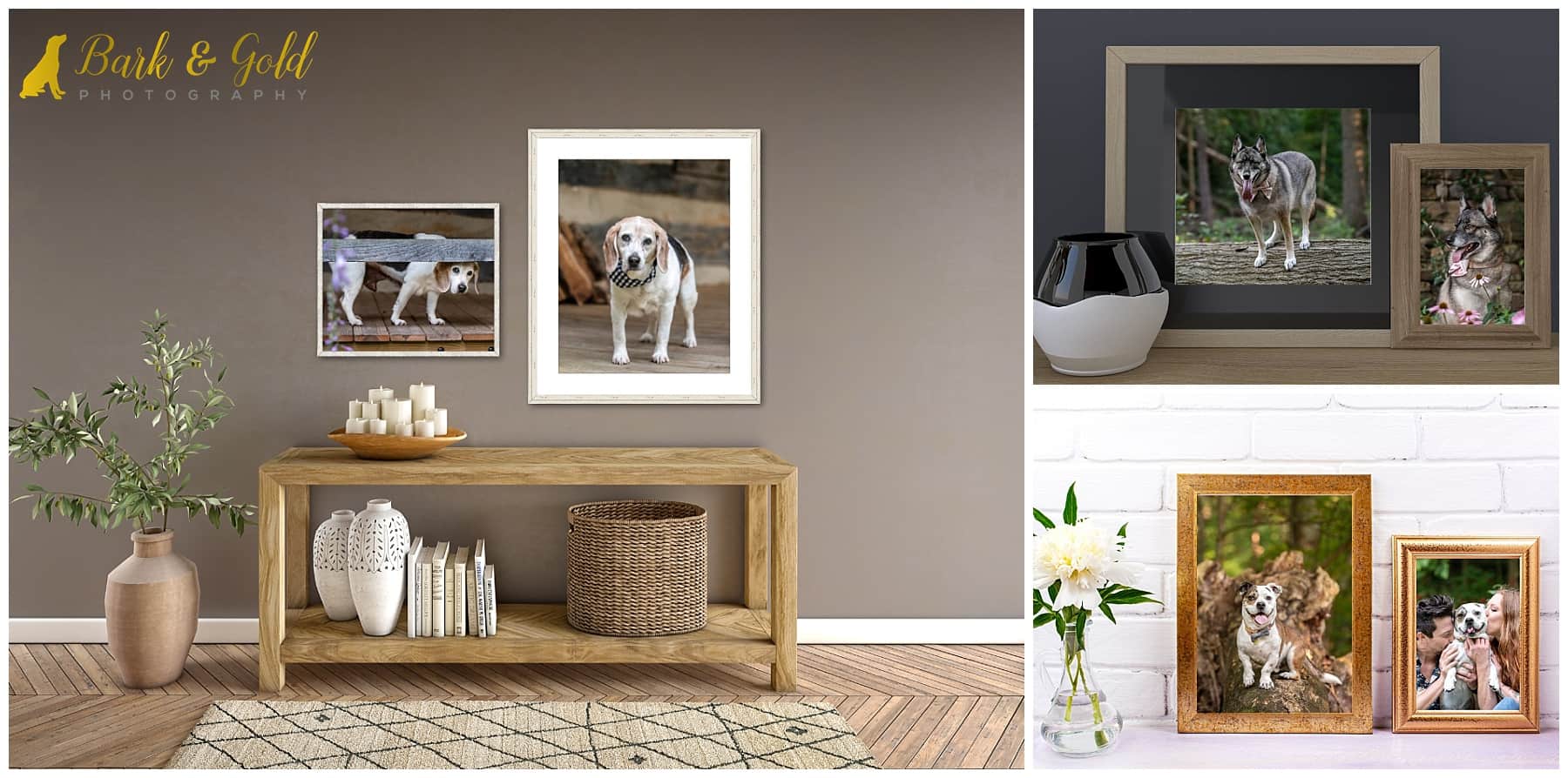
Flaunt ‘Em with Frames
The right frame anchors your artwork within the room and enhances the room’s décor, complementing without competing.
The style, color, and material of your frame can take your diptych from causal and light to formal and elegant, so it’s important to consider both your décor and the portraits themselves. You need not worry about pulling precise colors from your images to match your frame; focus more on their overall tones to craft the look and feel you want your art to convey. Play off of colors that aren’t the most dominant in the images to keep a balanced separation between print and frame.

That said, don’t fear mixing and matching your frames, even if that means various widths in related finishes. Displaying your diptychs in slightly different styles can look equally as beautiful and is one of the easiest ways to tie together two pieces. For example, a hand-hewn cream style in which your portrait fills the entire frame can pair perfectly with a subtly distressed off-white wood frame with a mat as long as two components are considered: first, that your images are similar enough that they make sense when displayed alongside one another and secondly, that each complements both frames when arranged on your wall.
Build in Balance with Asymmetry
For portraits that aren’t extremely alike yet share a similar look, like that of their frames, color scheme, or subject, consider an asymmetrical arrangement to create balance, enhance the energy of the space in which it’s displayed, and increase visual interest. You can achieve this by simply hanging one portrait slightly lower than the other. Organically, a staggered display looks best with larger pieces, a mix of vertical and horizontal art, or those that aren’t the exact same size.
Decorating with Dipytchs for Double Dog Delight
Eye-catching, spectacularly unexpected, and often understated storytelling tools, diptychs are particularly effective for portraits in which one simply isn’t enough; however, they should be thoughtfully displayed in order to achieve a visually appealing grouping, as suggested in the Minted article, “Styling Bliss Using Diptychs & Triptychs,” which explains that, “while they might not be tangibly connected to each other, the color palettes, subject matter, and other stylistic nods still make the collection seem like one work of art.”
If you’re intrigued by the unique visual synergy of diptychs, their design flexibility, and the pure joy that comes with being able to display multiple pet portraits, I encourage you to consider incorporating them into your home following your Bark & Gold Photography session for double dog delight!
Dreaming of a diptych of your dog? Let’s get designing the perfect pair for your home! Choose your adventure below to begin.
Did you enjoy this post? Great, there’s more coming your way because it’s part of a photography blog circle featuring photographers specializing in a variety of niches! To see more content like this and what the next photographer is sharing for our weekly theme, “Diptych Photography,” check out Gretchen Decker, owner and photographer of Gretchen Decker Photography, providing tips on how to look natural in your portraits. Continue to click the link at the end of each post in the blog circle until you eventually find your way back here.
One thought on “Decorate with Diptychs: Wall Art Designs for Double Dog Delight”